Background: we have data about users who hit our site, whether they converted or not as well as some of their characteristics such as their country , marketing channel, age, whether they are repeat users and number of pages visited during the session.
This notebook covers:
- Data Cleaning and visualization
- predict conversion rate by random forest method
- Come up with recommendations for the product team and the marketing team t improve conversion rate
Conclusions: 1. This site works very well for young users. 2.The site works very well for Germany in terms of conversion. 3.Users with old accounts do much better 4.Something is wrong with the Chinese version of the site.
import warnings
warnings.simplefilter('ignore')

import numpy as np
import pandas as pd
import seaborn as sns
import matplotlib.pyplot as plt
from sklearn.metrics import auc, roc_curve, classification_report
from IPython.display import display, Image, SVG, Math, YouTubeVideo
import h2o
from h2o.frame import H2OFrame
from h2o.estimators.random_forest import H2ORandomForestEstimator
from h2o.grid.grid_search import H2OGridSearch
%matplotlib inline
data = pd.read_csv('conversion_data.csv')
data.head()| country | age | new_user | source | total_pages_visited | converted | |
|---|---|---|---|---|---|---|
| 0 | UK | 25 | 1 | Ads | 1 | 0 |
| 1 | US | 23 | 1 | Seo | 5 | 0 |
| 2 | US | 28 | 1 | Seo | 4 | 0 |
| 3 | China | 39 | 1 | Seo | 5 | 0 |
| 4 | US | 30 | 1 | Seo | 6 | 0 |
data.info()<class 'pandas.core.frame.DataFrame'>
RangeIndex: 316200 entries, 0 to 316199
Data columns (total 6 columns):
country 316200 non-null object
age 316200 non-null int64
new_user 316200 non-null int64
source 316200 non-null object
total_pages_visited 316200 non-null int64
converted 316200 non-null int64
dtypes: int64(4), object(2)
memory usage: 14.5+ MB# for categorical variable
data['country'].value_counts()US 178092
China 76602
UK 48450
Germany 13056
Name: country, dtype: int64the site is probably us site, although it does have a large Chinese user base as well
# for quantitative variables
data.describe()| age | new_user | total_pages_visited | converted | |
|---|---|---|---|---|
| count | 316200.000000 | 316200.000000 | 316200.000000 | 316200.000000 |
| mean | 30.569858 | 0.685465 | 4.872966 | 0.032258 |
| std | 8.271802 | 0.464331 | 3.341104 | 0.176685 |
| min | 17.000000 | 0.000000 | 1.000000 | 0.000000 |
| 25% | 24.000000 | 0.000000 | 2.000000 | 0.000000 |
| 50% | 30.000000 | 1.000000 | 4.000000 | 0.000000 |
| 75% | 36.000000 | 1.000000 | 7.000000 | 0.000000 |
| max | 123.000000 | 1.000000 | 29.000000 | 1.000000 |
user base is pretty young, conversion rate at around 3% is industry standard. it make sense. everything seems to make sense here except for max age 123 yrs, lets check it:
for column in data.columns:
    uniques = sorted(data[column].unique())
    print('{0:20s} {1:5d}\t'.format(column, len(uniques)), uniques[:60])
country 4 ['China', 'Germany', 'UK', 'US']
age 60 [17, 18, 19, 20, 21, 22, 23, 24, 25, 26, 27, 28, 29, 30, 31, 32, 33, 34, 35, 36, 37, 38, 39, 40, 41, 42, 43, 44, 45, 46, 47, 48, 49, 50, 51, 52, 53, 54, 55, 56, 57, 58, 59, 60, 61, 62, 63, 64, 65, 66, 67, 68, 69, 70, 72, 73, 77, 79, 111, 123]
new_user 2 [0, 1]
source 3 ['Ads', 'Direct', 'Seo']
total_pages_visited 29 [1, 2, 3, 4, 5, 6, 7, 8, 9, 10, 11, 12, 13, 14, 15, 16, 17, 18, 19, 20, 21, 22, 23, 24, 25, 26, 27, 28, 29]
converted 2 [0, 1]there are just two people over 100 which seems unrealistic.
Remove Outliers
Typically, age should be below 100. So, first let check outliers and clean the dataset
data[data['age'] > 90]| country | age | new_user | source | total_pages_visited | converted | |
|---|---|---|---|---|---|---|
| 90928 | Germany | 123 | 0 | Seo | 15 | 1 |
| 295581 | UK | 111 | 0 | Ads | 10 | 1 |
Let’s first remove them directly.
data = data[data['age'] < 100]

# check if we removed it sucessfully
data.info()
<class 'pandas.core.frame.DataFrame'>
Int64Index: 316198 entries, 0 to 316199
Data columns (total 6 columns):
country 316198 non-null object
age 316198 non-null int64
new_user 316198 non-null int64
source 316198 non-null object
total_pages_visited 316198 non-null int64
converted 316198 non-null int64
dtypes: int64(4), object(2)
memory usage: 16.9+ MBExploratory Data Analysis
now let’s quickly investigate the variables and how their distribution differs for the two classes, this will help us understand whether there is any information in our data in the first place and get a sense of the data.
# Visualization of different countries

fig, ax = plt.subplots(nrows=1, ncols=2, figsize=(18, 6))
sns.countplot(x='country', hue='converted', data=data, ax=ax[0])
ax[0].set_title('Count Plot of Country', fontsize=16)

sns.barplot(x='country', y='converted', data=data, ax=ax[1]);
ax[1].set_title('Mean Conversion Rate per Country', fontsize=16)
plt.tight_layout()
plt.show()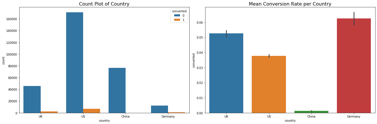
Here it clearly looks like Chinese covert at a much lower rate than other countries.
# Visualization of different user types
grouped = data[['new_user', 'converted']].groupby('new_user').mean().reset_index()

fig, ax = plt.subplots(nrows=1, ncols=2, figsize=(18, 6))
sns.countplot(x='new_user', hue='converted', data=data, ax=ax[0])
ax[0].set_title('Count Plot of User Types', fontsize=16)
#ax[0].set_yscale('log')
sns.barplot(x='new_user', y='converted', data=data, ax=ax[1]);
ax[1].set_title('Mean Conversion Rate per User Type', fontsize=16)
plt.tight_layout()
plt.show()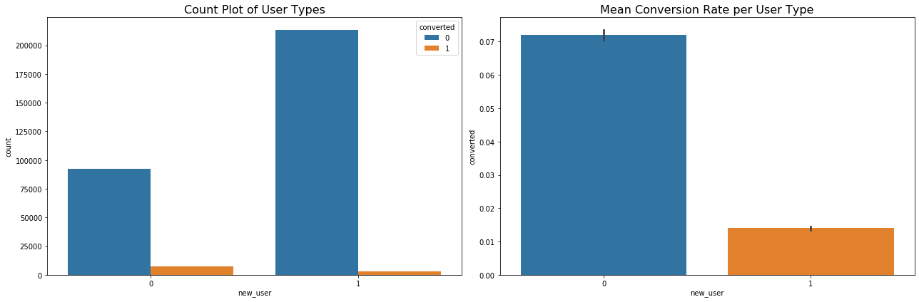
the new users’ conversion rate is lower than old user
# Visualization of different sources
grouped = data[['source', 'converted']].groupby('source').mean().reset_index()

fig, ax = plt.subplots(nrows=1, ncols=2, figsize=(18, 6))
sns.countplot(x='source', hue='converted', data=data, ax=ax[0])
ax[0].set_title('Count Plot of Different Sources', fontsize=16)
#ax[0].set_yscale('log')
sns.barplot(x='source', y='converted', data=data, ax=ax[1]);
ax[1].set_title('Mean Conversion Rate per Source', fontsize=16)
plt.tight_layout()
plt.show()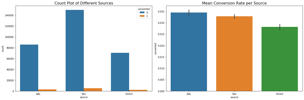
- customers who came to the site by clicking on an advertisement had the highest conversion rate.
- customers who came to the site by directly typing URL on the browser had the lowest conversion rate.
# Visualization of different age
grouped = data[['age', 'converted']].groupby('age').mean().reset_index()
hist_kws={'histtype': 'bar', 'edgecolor':'black', 'alpha': 0.2}

fig, ax = plt.subplots(nrows=1, ncols=2, figsize=(18, 6))

sns.distplot(data[data['converted'] == 0]['age'], label='Converted 0',
             ax=ax[0], hist_kws=hist_kws)
sns.distplot(data[data['converted'] == 1]['age'], label='Converted 1',
             ax=ax[0], hist_kws=hist_kws)

ax[0].set_title('Count Plot of Age', fontsize=16)
ax[0].legend()

ax[1].plot(grouped['age'], grouped['converted'], '.-')
ax[1].set_title('Mean Conversion Rate vs. Age', fontsize=16)
ax[1].set_xlabel('age')
ax[1].set_ylabel('Mean convertion rate')
ax[1].grid(True)
plt.show()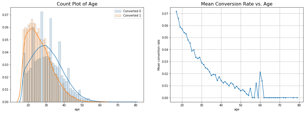
With the time goes by, the conversion rate decrease, it indicates the webiste means focus on young age group but for the age period from 55 to 62, there is a small peak of conversion rate.
# Visualization of different sources
grouped = data[['total_pages_visited', 'converted']].groupby('total_pages_visited').mean().reset_index()

fig, ax = plt.subplots(nrows=1, ncols=2, figsize=(18, 6))
sns.distplot(data[data['converted'] == 0]['total_pages_visited'],
             label='Converted 0', ax=ax[0], hist_kws=hist_kws)
sns.distplot(data[data['converted'] == 1]['total_pages_visited'],
             label='Converted 1', ax=ax[0], hist_kws=hist_kws)
ax[0].set_title('Count Plot of Age', fontsize=16)
ax[0].legend()


ax[1].plot(grouped['total_pages_visited'], grouped['converted'], '.-')
ax[1].set_title('Mean Conversion Rate vs. Total_pages_visited', fontsize=16)
ax[1].set_xlabel('total_pages_visited')
ax[1].set_ylabel('Mean convertion rate')
ax[1].grid(True)
plt.show()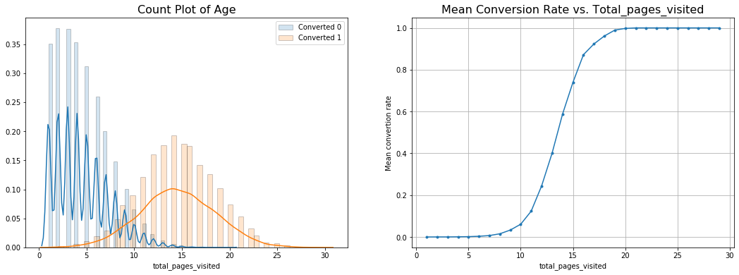
definitely spending more time on the site implies higher probability of conversion
Machine Learning
# Initialize H2O cluster
h2o.init()
h2o.remove_all()
Checking whether there is an H2O instance running at http://localhost:54321 ..... not found.
Attempting to start a local H2O server...
; Java HotSpot(TM) 64-Bit Server VM (build 25.181-b13, mixed mode)
Starting server from C:\Users\Naixin\Anaconda3\lib\site-packages\h2o\backend\bin\h2o.jar
Ice root: C:\Users\Naixin\AppData\Local\Temp\tmpmhgna45g
JVM stdout: C:\Users\Naixin\AppData\Local\Temp\tmpmhgna45g\h2o_Naixin_started_from_python.out
JVM stderr: C:\Users\Naixin\AppData\Local\Temp\tmpmhgna45g\h2o_Naixin_started_from_python.err
Server is running at http://127.0.0.1:54321
Connecting to H2O server at http://127.0.0.1:54321 ... successful.| H2O cluster uptime: | 03 secs |
| H2O cluster timezone: | America/Chicago |
| H2O data parsing timezone: | UTC |
| H2O cluster version: | 3.26.0.6 |
| H2O cluster version age: | 4 days |
| H2O cluster name: | H2O_from_python_Naixin_fptvaq |
| H2O cluster total nodes: | 1 |
| H2O cluster free memory: | 1.747 Gb |
| H2O cluster total cores: | 4 |
| H2O cluster allowed cores: | 4 |
| H2O cluster status: | accepting new members, healthy |
| H2O connection url: | http://127.0.0.1:54321 |
| H2O connection proxy: | None |
| H2O internal security: | False |
| H2O API Extensions: | Amazon S3, Algos, AutoML, Core V3, TargetEncoder, Core V4 |
| Python version: | 3.7.3 final |
- I am going to pick a random forest to predict conversion rate.
- I pick a random forest because: it usually
- requires very little time to optimize it (its default params are often close to the best ones)
- it is strong with outliers, irrelevant variables, continuous and discrete variables.
I will use the random forest to predict conversion, then I will use its partial dependence plots and variable importance to get insights about how it got information from the variables. Also, I will build a simple tree to find the most obvious user segments and see if they agree with RF partial dependence plots.
# Transform to H2O Frame, and make sure the target variable is categorical
h2o_df = H2OFrame(data)

h2o_df['new_user'] = h2o_df['new_user'].asfactor()
h2o_df['converted'] = h2o_df['converted'].asfactor()

h2o_df.summary()
Parse progress: |█████████████████████████████████████████████████████████| 100%| country | age | new_user | source | total_pages_visited | converted | |
|---|---|---|---|---|---|---|
| type | enum | int | enum | enum | int | enum |
| mins | 17.0 | 1.0 | ||||
| mean | 30.5693110013347 | 4.872918234777034 | ||||
| maxs | 79.0 | 29.0 | ||||
| sigma | 8.268957596421474 | 3.3410533442156267 | ||||
| zeros | 0 | 0 | ||||
| missing | 0 | 0 | 0 | 0 | 0 | 0 |
| 0 | UK | 25.0 | 1 | Ads | 1.0 | 0 |
| 1 | US | 23.0 | 1 | Seo | 5.0 | 0 |
| 2 | US | 28.0 | 1 | Seo | 4.0 | 0 |
| 3 | China | 39.0 | 1 | Seo | 5.0 | 0 |
| 4 | US | 30.0 | 1 | Seo | 6.0 | 0 |
| 5 | US | 31.0 | 0 | Seo | 1.0 | 0 |
| 6 | China | 27.0 | 1 | Seo | 4.0 | 0 |
| 7 | US | 23.0 | 0 | Ads | 4.0 | 0 |
| 8 | UK | 29.0 | 0 | Direct | 4.0 | 0 |
| 9 | US | 25.0 | 0 | Ads | 2.0 | 0 |
# Split into 75% training and 25% test dataset
strat_split = h2o_df['converted'].stratified_split(test_frac=0.25, seed=42)

train = h2o_df[strat_split == 'train']
test = h2o_df[strat_split == 'test']

feature = ['country', 'age', 'new_user', 'source', 'total_pages_visited']
target = 'converted'
# Build random forest model
model = H2ORandomForestEstimator(balance_classes=True, ntrees=100, max_depth=20,
mtries=-1, seed=42, score_each_iteration=True)
model.train(x=feature, y=target, training_frame=train)drf Model Build progress: |███████████████████████████████████████████████| 100%# Feature importance
importance = model.varimp(use_pandas=True)
fig, ax = plt.subplots(figsize=(10, 8))
sns.barplot(x='scaled_importance', y='variable', data=importance)
plt.show()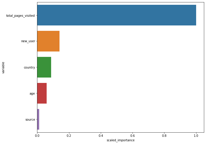
total pages visited is the most important one, by far. Unfortunately, it is probably the least “actionable”. People visit many pages cause they already want to buy. Also, in order to buy you have to click on multipages
# Make predictions
train_true = train.as_data_frame()['converted'].values
test_true = test.as_data_frame()['converted'].values
train_pred = model.predict(train).as_data_frame()['p1'].values
test_pred = model.predict(test).as_data_frame()['p1'].values

train_fpr, train_tpr, _ = roc_curve(train_true, train_pred)
test_fpr, test_tpr, _ = roc_curve(test_true, test_pred)
train_auc = np.round(auc(train_fpr, train_tpr), 3)
test_auc = np.round(auc(test_fpr, test_tpr), 3)
drf prediction progress: |████████████████████████████████████████████████| 100%
drf prediction progress: |████████████████████████████████████████████████| 100%# Classification report
print(classification_report(y_true=test_true, y_pred=(test_pred > 0.5).astype(int))) precision recall f1-score support
0 0.99 1.00 0.99 76500
1 0.84 0.63 0.72 2550
accuracy 0.98 79050
macro avg 0.91 0.82 0.86 79050
weighted avg 0.98 0.98 0.98 79050fig, ax = plt.subplots(figsize=(8, 6))
ax.plot(train_fpr, train_tpr, label='Train AUC: ' + str(train_auc))
ax.plot(test_fpr, test_tpr, label='Test AUC: ' + str(test_auc))
ax.set_xlabel('False Positive Rate', fontsize=12)
ax.set_ylabel('True Positive Rate', fontsize=12)
ax.legend(fontsize=12)
plt.show()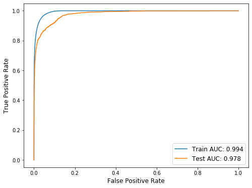
_ = model.partial_plot(train, cols=feature, figsize=(8, 15))PartialDependencePlot progress: |█████████████████████████████████████████| 100%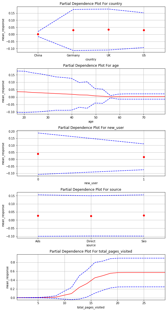
In partial dependency plots, we just care about trends, not the actual y value so this shows:
- user with old account are better than new users
- china is really bad, all other country are similar with Germany being the best
- the site works very well for young people and bad for less young people(>30)
- source is irrelative
Conclusions and suggestions:
i = Image(filename='conclusion.png')
i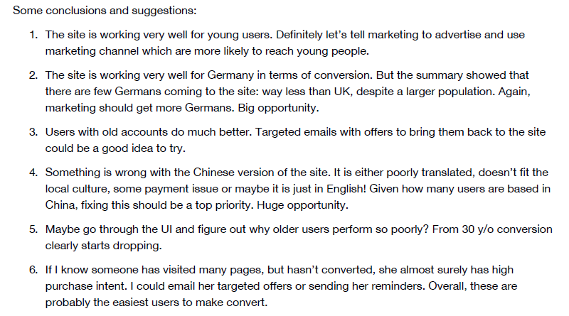
# Shutdown h2o instance
h2o.cluster().shutdown()
H2O session _sid_a87c closed.